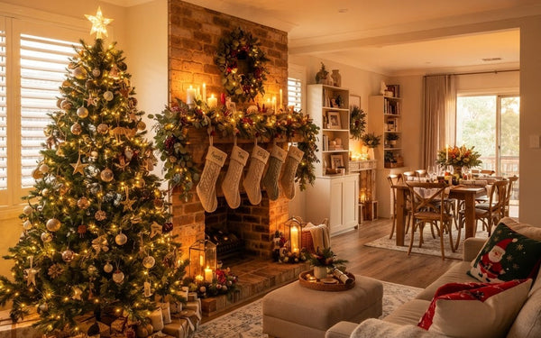


Quick answer: choose a Christmas colour palette that belongs in your room
Start with the colours already in your room, then choose one main Christmas colour, one supporting colour and a smaller accent. Red and green give a classic contrast; blue and white feel crisp; natural green with warm neutrals is quieter; plum with metallic touches feels rich; and multicolour keeps things playful. Repeat your chosen colours across the tree and nearby decorations, and check real items together in your room’s light before committing.
Christmas colour palette ideas for Australian homes
A palette is a useful starting point, not a decorating rulebook. The same colours can feel quite different depending on their shade, finish, surrounding materials and the amount of daylight in a room. Here are five combinations to use as inspiration, whether you decorate a full living room, a compact apartment or an outdoor entertaining area.
Classic red and green
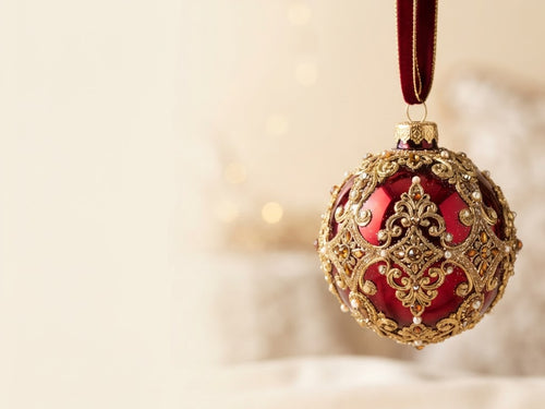
Red and green create a familiar, high-contrast Christmas look. You can keep it traditional with clear red ornaments and deep green foliage, or soften it with burgundy, dusty green and natural textures. If the room already has strong colours, repeat just one or two red accents elsewhere rather than adding red to every surface. A small amount of gold or warm wood can sit alongside the pair, but it need not become a third dominant colour.
Coastal blue and white
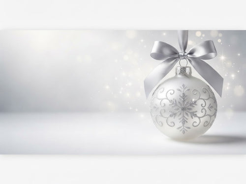
Blue and white make a bright, clean combination that suits relaxed Australian interiors as readily as a formal tree. Try navy with white for more contrast, or pale blue with soft white for a gentler effect. Silver can add a cool reflective accent; explore white and silver decorations for another variation. The useful test is whether the blue belongs with the room’s existing textiles and finishes, not whether it matches a particular idea of a coastal home.
Natural green and warm neutrals
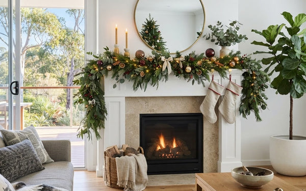
For a restrained scheme, pair foliage green with cream, tan, timber tones or muted metallics. This keeps the tree connected to natural materials already in the room. Varying finishes can stop a limited palette from feeling flat: combine matte and glossy ornaments, smooth ribbons with textured surfaces, or different shades of green. Keep the overall balance calm by repeating the neutral tones around the tree rather than introducing several unrelated accent colours.
Plum, burgundy and metallic accents
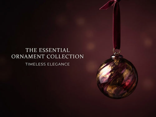
Deep plum and burgundy can make a room feel dressed for the occasion without relying on bright red. Choose one of those rich hues as the anchor, then use a lighter colour such as cream or a metallic finish to create breathing space. If the room already includes dark furniture or strong wall colours, use the deeper ornaments selectively. A few repeated accents often feel more intentional than spreading every colour evenly across every surface.
Multicolour and playful combinations
A multicolour tree can be exuberant and personal. To give it a sense of order, repeat a few colours in more than one place, or group ornaments by colour as you decorate. Alternatively, let the colours mix freely and keep the surrounding mantel or table simpler. There is no requirement for every decoration to match. The goal is to decide whether you want the tree to be the main visual feature or part of a broader, colourful room.

How to choose a Christmas colour scheme that suits your room
Before buying or unpacking decorations, take a quick look around the space. Notice its dominant colours, the finishes that already repeat, and the places where your decorations will sit. A colour scheme works best when it feels connected to its setting, even if the Christmas colours themselves are new.
Begin with what is staying
Pick out two or three colours already present in the room, such as a sofa fabric, rug, curtains, timber or wall colour. You do not have to match those exactly. Instead, decide whether your Christmas palette should blend with them, provide contrast, or introduce one deliberate pop of colour. If you are keeping familiar decorations, treat them as part of the starting palette rather than trying to replace everything.
Choose the mood, then the relationship
Think in broad terms: traditional, calm, bright, dramatic or playful. A colour wheel can help you understand relationships between colours. Dulux describes approaches including monochromatic schemes, which use variations of one hue; harmonious schemes, which use related hues; and contrasting schemes, which place more distinct colours together. Complementary pairs sit opposite one another on the wheel, such as red and green, blue and orange, or purple and yellow. These are useful ways to plan, not rules that every Christmas scheme must follow.
Build a simple colour hierarchy
Give the palette a main colour, a supporting colour and an accent. The main colour sets the overall impression; the supporting colour helps it feel balanced; and the accent adds a small moment of contrast or shine. You can use several shades of the same colour within that structure. If a percentage guide helps, the familiar 60/30/10 rule of thumb suggests roughly 60% main colour, 30% supporting colour and 10% accent; together those parts make 100%. Treat it as a loose visual prompt, not a measured requirement or an ornament-count formula. This is more flexible than insisting on an exact number of colours, and it makes it easier to decide whether a new decoration belongs.
Test before you commit
Place a few existing ornaments, fabric samples or product images together near the tree location. Check them in the room rather than judging from a phone screen alone. Dulux’s colour guidance recommends considering undertones, lighting and texture when making paint choices; for Christmas decorations, the practical takeaway is to look at the actual finishes in the space where they will be used. A glossy ornament, a matte bauble and a metallic ribbon can reflect light differently even when their colours appear similar online.

Christmas tree colour schemes: choose a base, supporting colour and accent
The tree is often the largest single decoration, so it can anchor the palette for the rest of the room. Start by deciding what role the tree should play. It might echo the room quietly, carry the strongest colour in the space, or bring together colours already used in nearby decorations.
Next, choose a base colour that works with the tree and its surroundings. Green foliage gives a natural starting point, while a white or snowy tree changes the overall contrast. Add a supporting colour through ornaments or ribbon, then use an accent more sparingly. For example, a green tree with cream decorations and a few burgundy details reads differently from the same tree covered evenly in red, cream and metallic ornaments.
How lighting, materials and daylight change the look
A colour palette is seen through its surroundings. Daylight, room lighting and the finishes on ornaments all affect how colours appear. A cool-looking silver finish can feel different beside warm timber than it does against white walls. Likewise, a pale blue decoration can seem more noticeable when surrounded by dark green than when placed beside white.
Texture gives a palette depth without requiring more colours. Smooth, ribbed, glittered, matte and reflective surfaces can create contrast within a limited scheme. Natural materials can soften a high-contrast combination, while shiny finishes can make a restrained palette feel more festive. These are visual choices, so use what feels right alongside the objects and surfaces already in your home.
Repeat your palette across the tree, mantel, table and entry
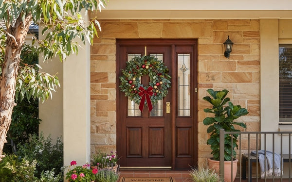
Once the tree palette feels settled, carry one or two of its colours into nearby areas. A repeated ribbon colour, a similar metallic finish or a matching accent on the table can make the room feel considered without making every surface identical. You can also repeat the palette at the entry with a wreath or a small arrangement.

Fresh Christmas colour combinations to try
There is no reliable trend-volume evidence in this brief to rank the most popular Christmas palettes for this year. Treat these combinations as fresh ideas to explore rather than verified trend forecasts. A muted blue with white and silver can feel crisp; plum with cream can feel rich; natural green with soft neutrals can feel understated; and a bright multicolour scheme can make familiar decorations feel lively.
Shop Christmas decorations by colour
Explore colour-led decorations and build a palette that works with your home.
Frequently Asked Questions — Christmas Colour Palettes
How do I choose a Christmas colour palette?
Start with the colours and materials already in your room, then decide on the mood you want. Choose a main colour, a supporting colour and a smaller accent, and check the combination beside your decorations in the room’s lighting before committing.
What colours go well together for Christmas?
Red and green are a familiar complementary pair. Blue and orange, or purple and yellow, are also complementary pairs on the colour wheel. For a softer look, choose related shades or use neutrals and metallic finishes as supporting accents.
What are some Christmas colour palette ideas for Australian homes?
Try classic red and green, coastal blue and white, natural green with warm neutrals, plum or burgundy with metallic accents, or a playful multicolour scheme. These are styling options, not measured rankings of what Australian households prefer.
How do I choose a Christmas tree colour scheme?
Choose colours that suit both the tree and the room. Repeat a small selection across ornaments, ribbon and nearby decorations, then vary finishes and textures to add depth. Build the look in stages and step back to check the overall balance.
Can I use blue and silver for Christmas decorations?
Yes. Use blue as the main colour and silver or white as lighter supporting shades. Repeat those tones across the tree and nearby decorations so the palette feels connected, and check the actual finishes together in your room.
What is a good Christmas colour palette for a small room?
Use the room’s existing neutral or dominant colour as an anchor and repeat a restrained selection of Christmas accents. This can keep the display from feeling busy, but no particular palette will make every small room look larger.
What Christmas colour palettes are popular?
This guide does not have reliable trend-volume data to confirm a leading palette. For inspiration, consider blue with white, plum with cream, natural green with neutrals, or bright multicolour, and choose the combination that suits your home.
Where can I find Christmas colour palette HEX codes?
Digital palette tools can help you compare HEX colour values for designs on screen. HEX codes describe digital colours, so for physical ornaments and fabrics, judge the real item in your room’s lighting rather than relying on the screen preview.